
Booking a trip should take three taps, not seven.
- Sector
- Travel booking
- Type
- Booking platform
- Year
- 2025
- Timeline
- 3 weeks
- Built with
- Figma, Laravel, JavaScript, VS Code
- Investment
- 450 000 Ft
- Address
- Not published
This one is a design project. Every screen below was designed and built, but the site was never published to a public address — so there is no live link to open.
See it work.
 Walkthrough recording soon
The project in three parts
The problem
Paradise sold breathtaking destinations through an interface that looked like a spreadsheet. Seven steps to book, six seconds to load on mobile, and most visitors left before they ever reached the form.
What I built
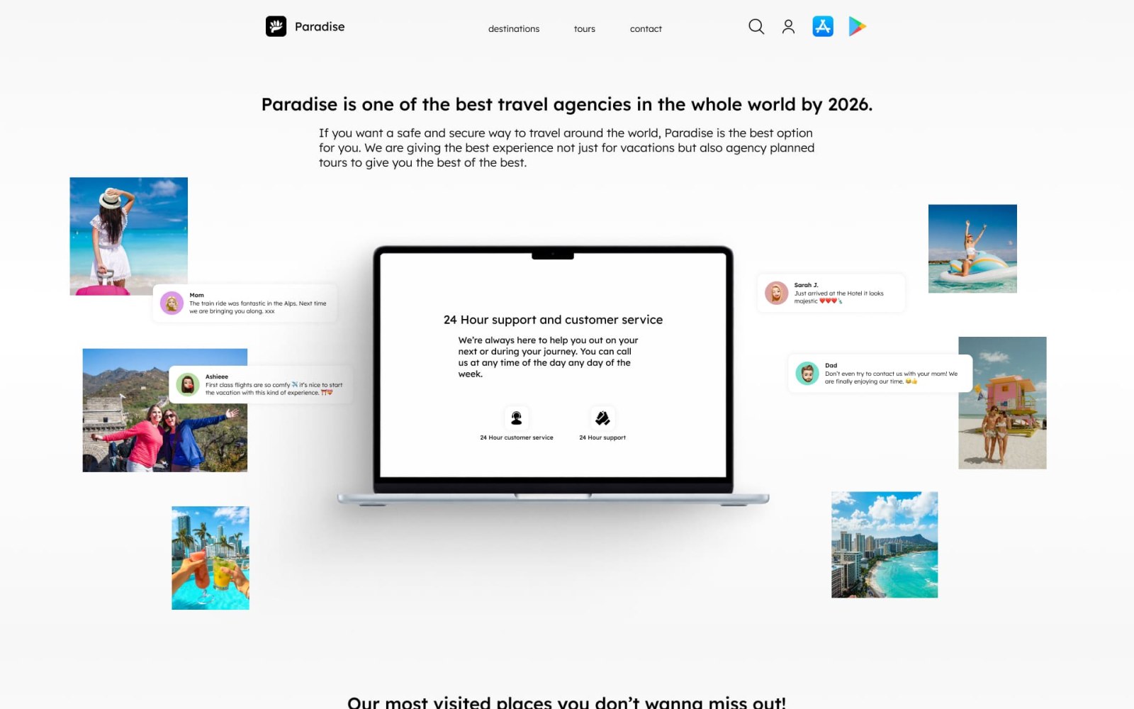
I rebuilt the booking flow around the photography and cut it to three steps. Destination cards load progressively, the cruise showcase unfolds on scroll, and the booking action sits within reach on the very first screen.
- Three-step booking flow
- Progressive image loading
- Mobile-first from the start
What it was worth
A booking flow short enough to finish from a beach chair on 4G, with the photography doing the selling instead of a specification table.
The site they had, and the site they have now.
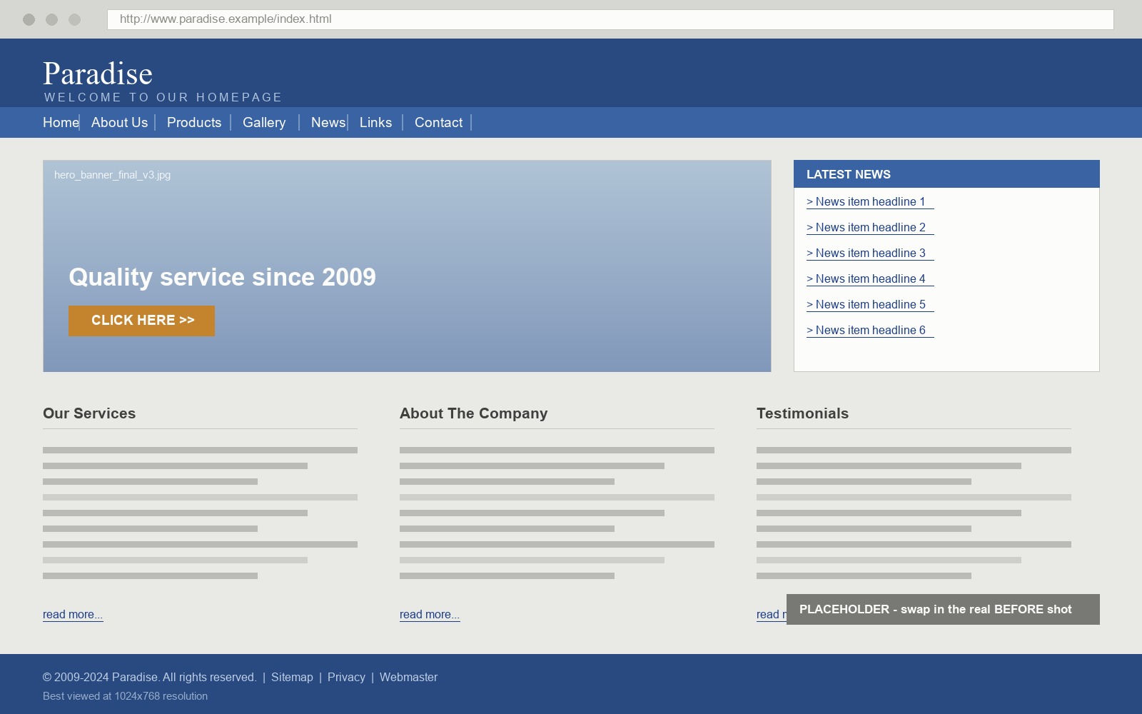
Drag the handle, or use the arrow keys, to reveal the rebuild.
The old site buried every destination in a dense list — small thumbnails, cramped type, the booking form three scrolls down. The rebuild puts the photography first and the booking action on screen one.
Every screen, full length.
Click any screen to open it full size.
Want the same for your business?
Tell me what your site has to achieve and roughly what you can spend. You get a fixed quote and a delivery date in writing — before anything starts.
- hello@blckt.hu
- Phone
- +36 30 255 2432